How Color Shapes the Soul of Your Home: Interior Color Guide & Trends for 2026
What Truly Turns a House Into a Home?
Is it the brand of the furniture? The square meters?
As an architect, my answer is clear: how the space makes you feel.
And the most powerful magician behind that feeling is color.
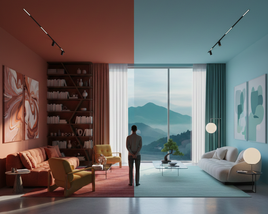
Color in architecture is never just a layer of paint. It is a spatial tool—one that can expand walls, lift ceilings, warm a room, or cool it down. The right palette can help you end a chaotic day with calm, while the wrong choice can turn even the largest living room into a compressed box.
Today, I’m sharing my architectural notes with you.
From room psychology to the 2026 design vision—here is a comprehensive color guide.
The First Question: “How Do I Want to Feel Here?”
Before trends, we must focus on emotions. Color psychology defines how a space functions:
Warm Colors (Red, Orange, Yellow)
They energize a space and stimulate conversation and appetite.
Be careful: overuse can make walls feel like they’re closing in.
Cool Colors (Blue, Green, Purple)
Known in architecture as receding colors. They add depth, making rooms feel larger and airier, while calming the mind.
Neutrals (Greige, Beige, Cream)
The key to balance. Timeless tones that allow other colors to shine.
Room-by-Room Color Strategies: Every room has a purpose—and color should serve it.
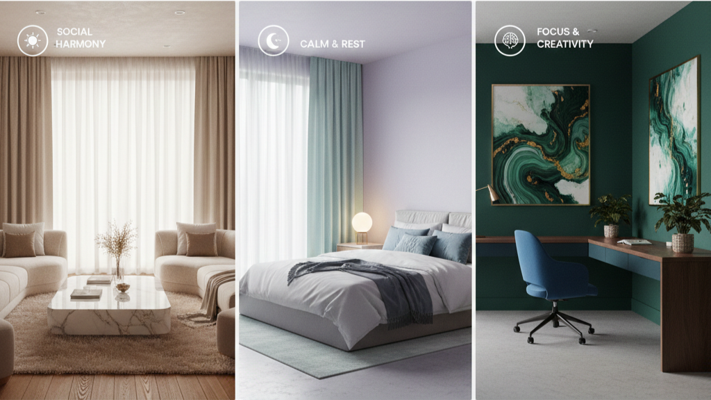
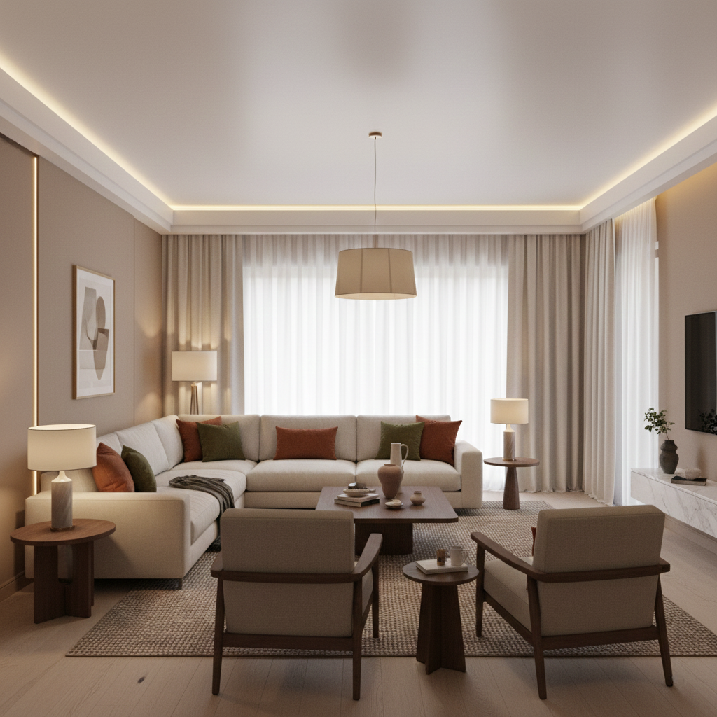
Living Room: The Social Core
This is where you unwind and entertain.
Architect’s Tip:
Use warm neutrals (sand beige, taupe) as a base. Add character through accents like terracotta or olive green in accessories.
Pro Tip:
If your ceiling feels low, always paint it one or two shades lighter than the walls. This visually lifts the space.
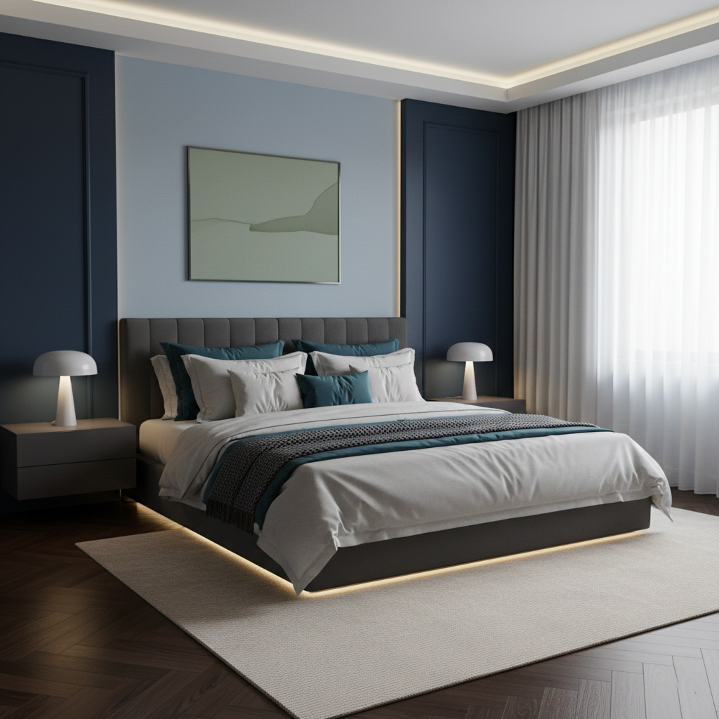
Bedroom: A Sanctuary of Calm
This is where you release the weight of the day—avoid aggressive tones.
Architect’s Tip:
Cool undertones work best. Sage green or powder blue help slow the heart rate.
Trend Alert:
Be bold. Dark charcoal or midnight blue bedrooms, when paired with the right lighting, create a “cocoon effect” that can actually improve sleep quality.
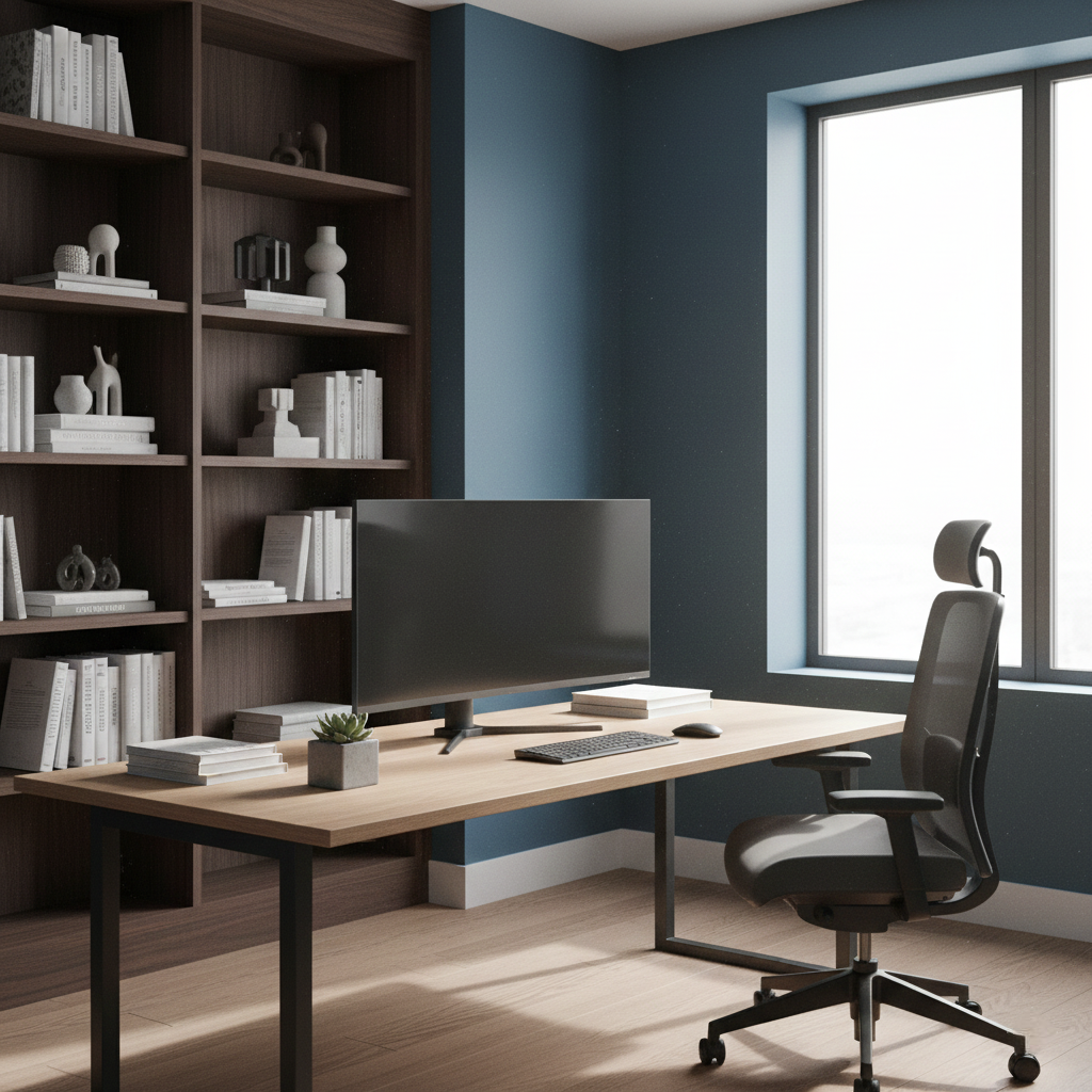
Home Office: The Focus Zone
Architect’s Tip:
Emerald green or ocean blue. Green supports concentration; blue boosts productivity. Avoid harsh, bright whites that strain the eyes.
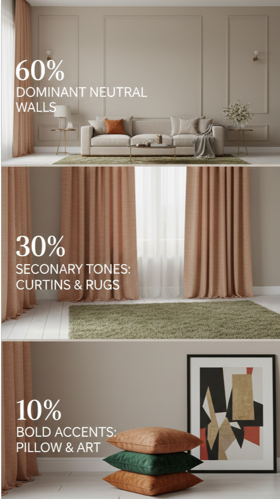
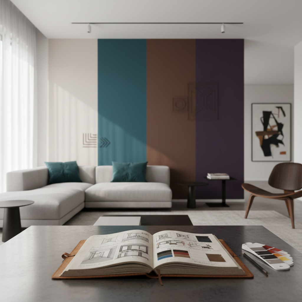
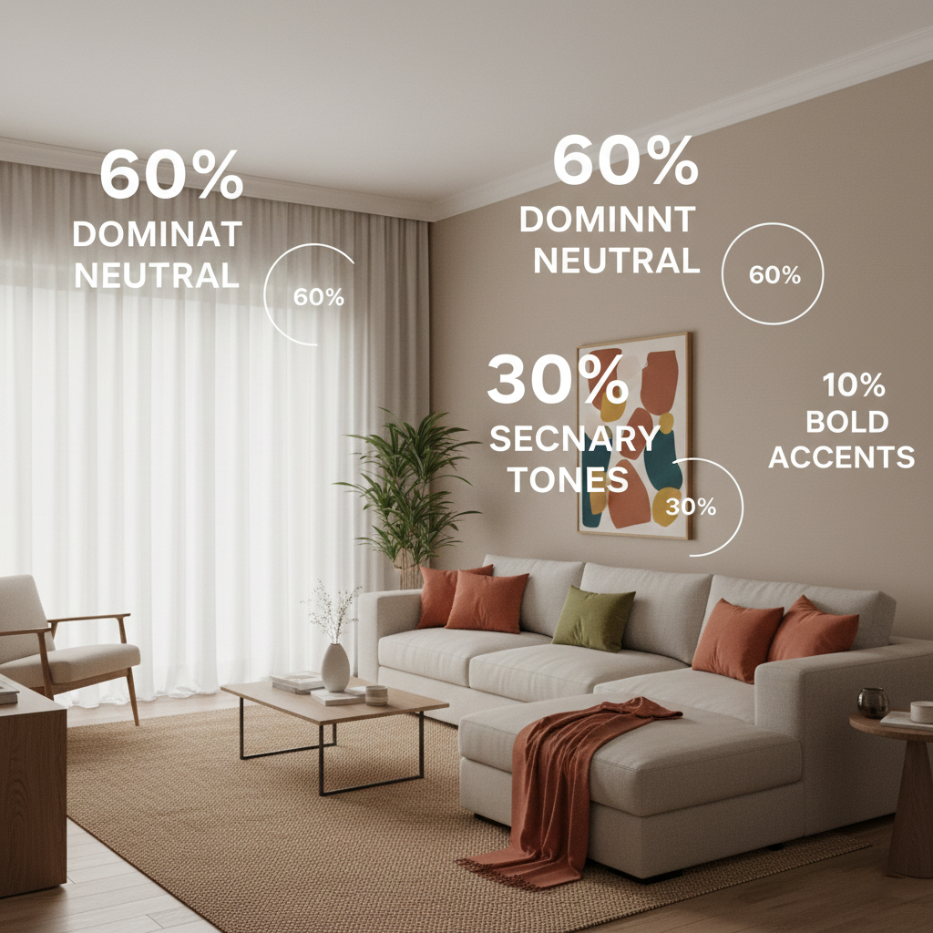
The Golden Rule: The 60–30–10 Formula
For a professional, well-balanced look, use the architects’ classic formula:
- 60% Main Color: Walls and large surfaces (usually neutrals)
- 30% Secondary Color: Curtains, rugs, or an accent chair
- 10% Accent Color: Cushions, vases, artwork—bold and expressive
Looking Ahead: 2026 Interior Design Trends
Escaping Chaos: The Color of Calm
After years of global fatigue and visual noise, 2026 speaks a single design language: relaxation.
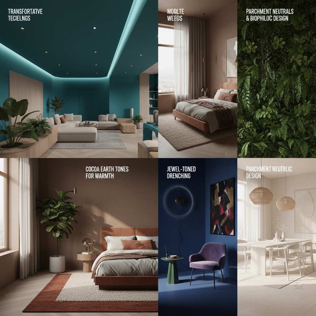
“Transformative Teal”
A strong candidate for 2026’s signature color.
Balancing the calm of blue with the vitality of green, this tone adds sophisticated, ocean-like depth—especially powerful on ceilings and in workspaces.
Goodbye Grey, Hello Cocoa & Earth
The long reign of grey is ending. In its place: cocoa, cinnamon, and burnt earth tones. These colors create a nostalgic, grounding, and deeply comforting atmosphere.
Jewel Tones & Mystical Darkness
Plum, aubergine, and burgundy are back. Not just in cushions—but on entire walls, doors, and trims. Color drenching will define dramatic, theatrical interiors in 2026.
“Wax Paper” Neutrals
Cold hospital whites are officially over. Instead, softly yellow-undertoned parchment and waxy whites that diffuse light gently and feel closer to natural daylight.
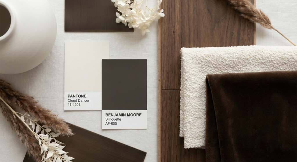
2026 Color Vision Through Global Brands
The 2026 palette centers on mental clarity, nature, and timeless simplicity. Brands now define the home as a sanctuary.
- Pantone — Cloud Dancer (11-4201)
A soft, cloud-like white symbolizing mental clarity. For architects, it’s a blank canvas for creativity. - Benjamin Moore — Silhouette (AF-655)
A luxurious blend of burnt umber and charcoal. A deep espresso tone for refined, timeless elegance. - Sherwin-Williams — Universal Khaki (SW 6150)
A warm khaki with subtle yellow undertones—ideal for long-term comfort and grounding.
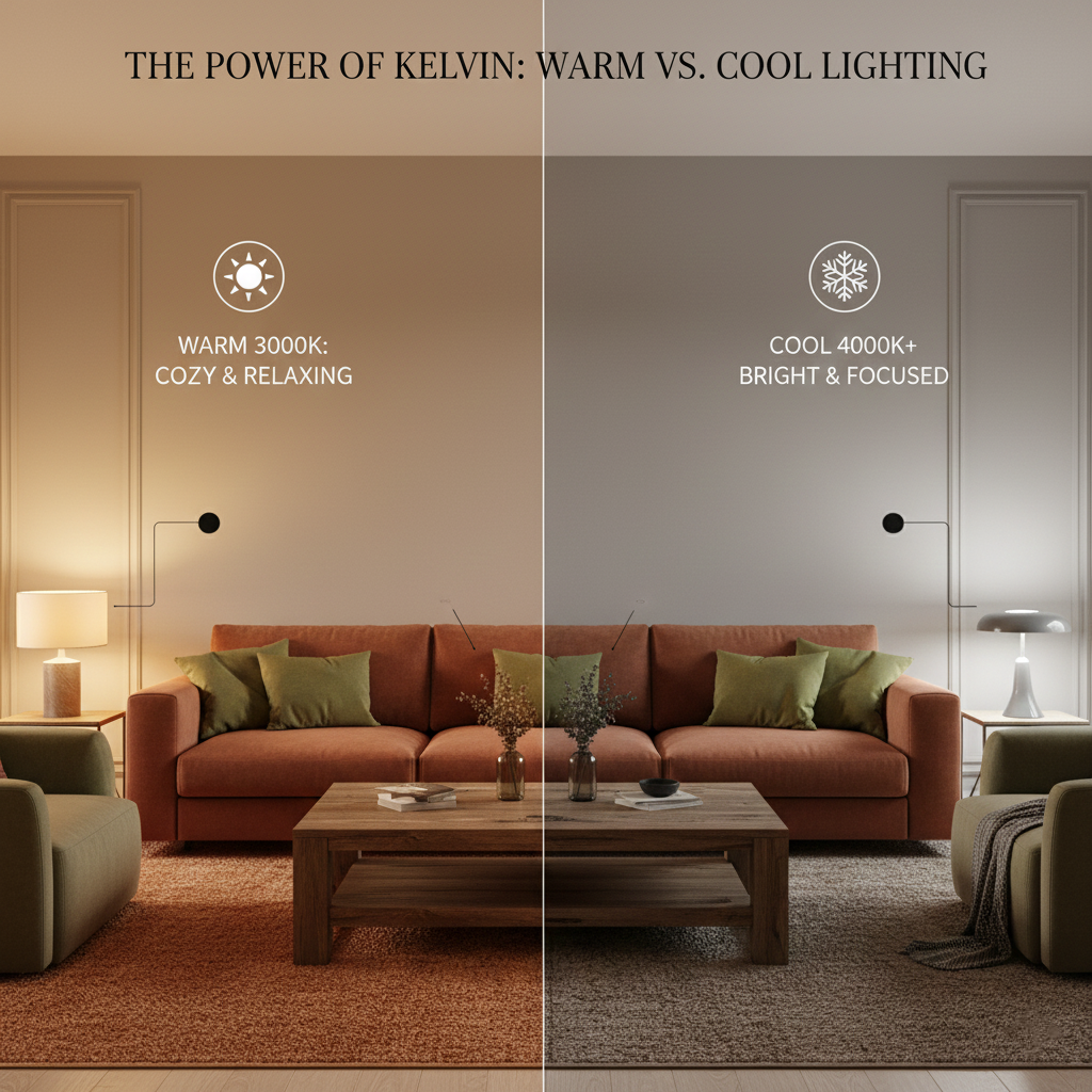
A Final Architect’s Note: Light Is Everything
Before committing to that perfect color, check your lighting.
- Warm light (3000K) enhances warm tones
- Cool light (4000K+) sharpens blues
Trust your home lighting—not the store’s.
Your home is your canvas. Don’t be afraid to pick up the brush.
For more insights, explore “The Secrets of Choosing the Right Color for Your Home.”
🎨 MINI QUIZ: What’s Your 2026 Color Palette?
Choose the option that feels closest to you and keep track of which letter you select most often.
1) After a long, exhausting day, what do you want to feel the moment you step into your home?
A) My mind clears, and I instantly feel lighter.
B) Safe, warm, and grounded.
C) Enveloped in a stylish, dimly lit atmosphere—completely disconnected from the outside world.
2) What does your ideal Sunday morning look like?
A) Bright daylight filtering through sheer white curtains.
B) A misty forest view, the scent of wood, and the warmth of a soft blanket.
C) Low light, the aroma of coffee, and rich, high-quality furniture around me.
3) Which decorative details are indispensable in your home?
A) Glass objects, white ceramics, and plenty of visual breathing space.
B) Woven baskets, linen fabrics, and dried plants.
C) Velvet textures, dark metal accents, and large-scale art pieces.
4) How does the chaos of the outside world affect you the most?
A) I feel overwhelmed by visual noise and crave simplicity.
B) I feel disconnected from nature and want to return to my roots.
C) I want to retreat into a private, refined space and turn inward.
📊 RESULTS: Meet the Spirit of Your 2026
Mostly A’s: “Above the Clouds” — The Cloud Dancer Spirit
Your 2026 keyword: Lightness
You’re mentally exhausted by complexity. Your home should function as a space for clarity and emotional detox.
Your Color: Pantone Cloud Dancer
Architect’s Advice:
Use this cloud-like white on your walls and furnish the room with only essential, functional pieces. Don’t be afraid of empty space—it’s a design tool, not a void.
Mostly B’s: “In the Heart of Nature” — Universal Khaki & Mushroom Neutrals
Your 2026 keyword: Security
You’re searching for the grounding, protective warmth of nature in your home.
Your Colors: Sherwin-Williams Universal Khaki and mushroom tones
Architect’s Advice:
Pair earthy colors with terracotta and raw wood textures. Introduce plenty of live plants to enhance the grounding effect throughout your space.
Mostly C’s: “Elegance of the Night” — Silhouette & Deep Teal Spirit
Your 2026 keyword: Depth
You don’t enjoy the ordinary. Your home is both your signature and your sanctuary.
Your Colors: Benjamin Moore Silhouette or Transformative Teal
Architect’s Advice:
Be bold. Paint a feature wall—or an entire study—in these deep tones to create a theatrical atmosphere. Use warm, low lighting to achieve a sense of refined mystery.
Closing Note for the Blog
“Remember: colors shape the soul of a space, accessories give that soul a voice.
Choose your palette—and rediscover your home through the calm vision of 2026.”