In interior design, color is not just about painting walls. It is one of the most powerful design tools that shapes a space’s perception, its relationship with light, and most importantly, how you feel inside it.
Choosing the right color requires much more than picking a shade from a color chart. As an architect, I’ve gathered professional insights to guide you through a color selection process that can truly transform the soul of your home.
The Dance of Light:
When Does Your Room Meet the Sun?
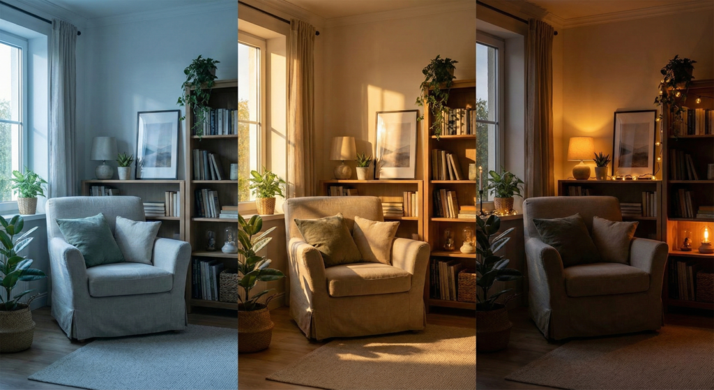
Light is the key factor that determines how a color appears on a wall. As light changes throughout the day, the same color can take on an entirely different character. Before choosing a color, take a moment to understand how your space interacts with light.
East-Facing Rooms (Morning Light): Morning light is cool, fresh, and slightly bluish. Pure whites or cool greys can feel unexpectedly cold and distant in these rooms. To balance this effect, opt for creamy whites, warm beiges, or colors with soft yellow undertones to gently warm up the space.
West-Facing Rooms (Afternoon Light): These rooms receive the warmest, most golden light of the day. Orange and red tones can become overwhelming under this light, making the space feel heavy. Cooler neutrals—such as icy blues or cool greys—help soften this intensity. If you love warmth, you can lean into sunset tones, but always with intention.
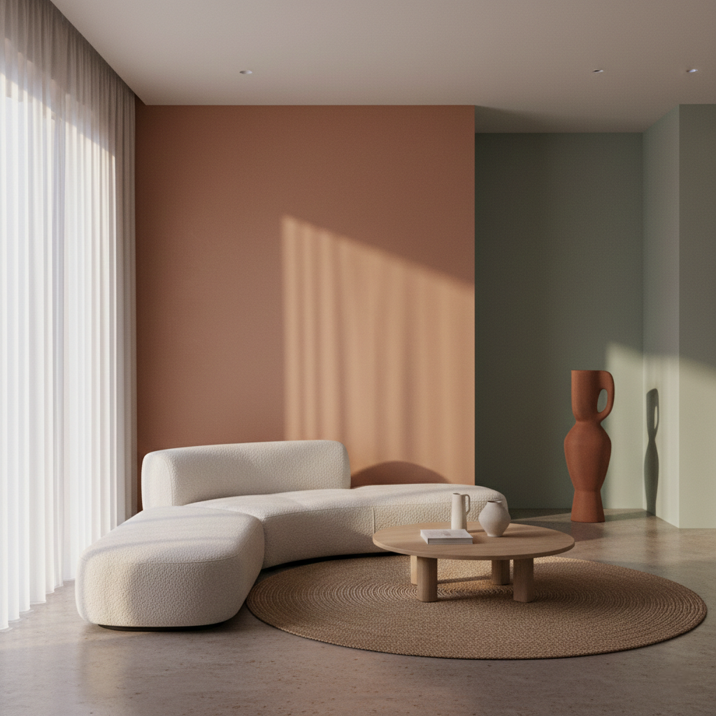
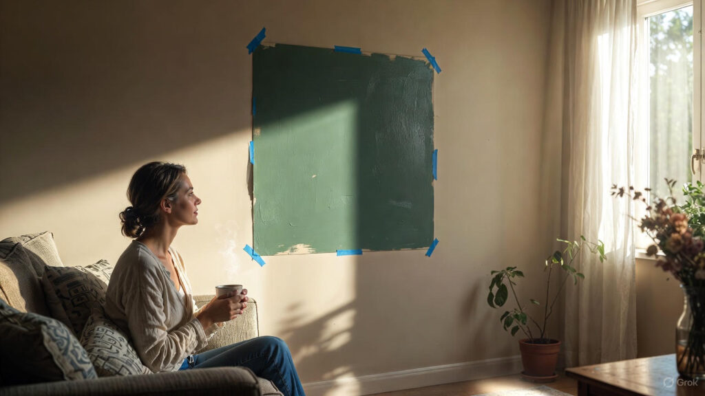
South-Facing Rooms (All-Day Light): These are the most flexible spaces in a home. Strong, consistent daylight allows both warm and cool colors to appear true to themselves. It’s also the safest place to experiment with darker, more dramatic tones without the room feeling cave-like.
Low-Light & Artificially Lit Spaces (North-Facing or Windowless Rooms): Here, the rules change. Painting a poorly lit room white won’t necessarily make it brighter; shadows can turn white surfaces grey and dull. Instead of fighting the lack of light, embrace it.
Understand Kelvin Values: Warm light (low Kelvin) enhances warm tones but can dull blues. Cool white light (high Kelvin) sharpens cool colors.
Creating Atmosphere: In low-light spaces, rather than chasing brightness, aim for a cocoon-like atmosphere. Warm lighting paired with colors such as terracotta, burnt orange, or deep reds can create an intimate and inviting mood.
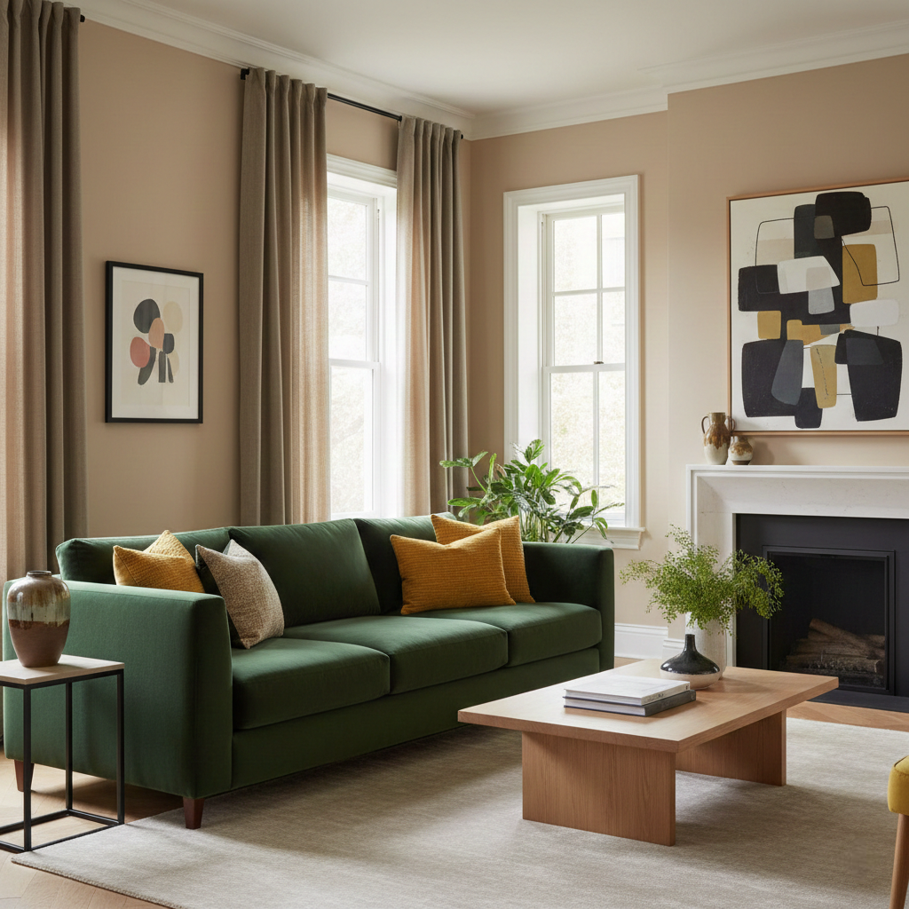
Architects often rely on this simple yet effective ratio to create visual harmony:
60% Dominant Color: Large surfaces such as walls, usually in neutral tones.
30% Secondary Color: Furniture, curtains, or rugs that support the main color.
10% Accent Color: Cushions, artwork, or accessories that add personality and contrast.
Design with Function and Psychology in Mind
Colors communicate emotions, and each room serves a different purpose.
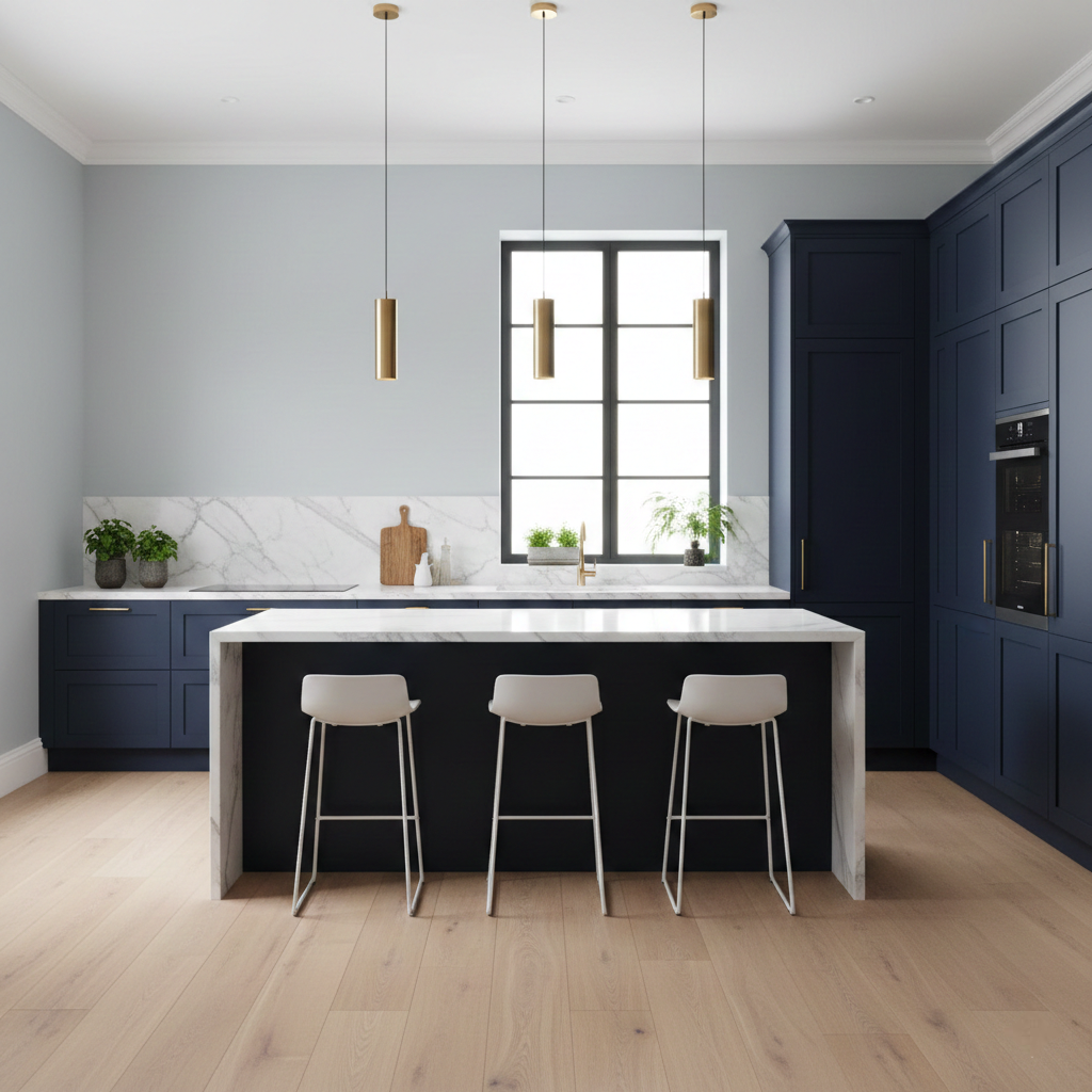
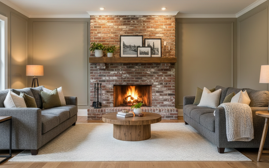
Living Room: A social space. Avoid overly sterile whites. Warm greys and earthy tones encourage conversation. For a modern touch, consider a single accent wall in deep navy or emerald green.
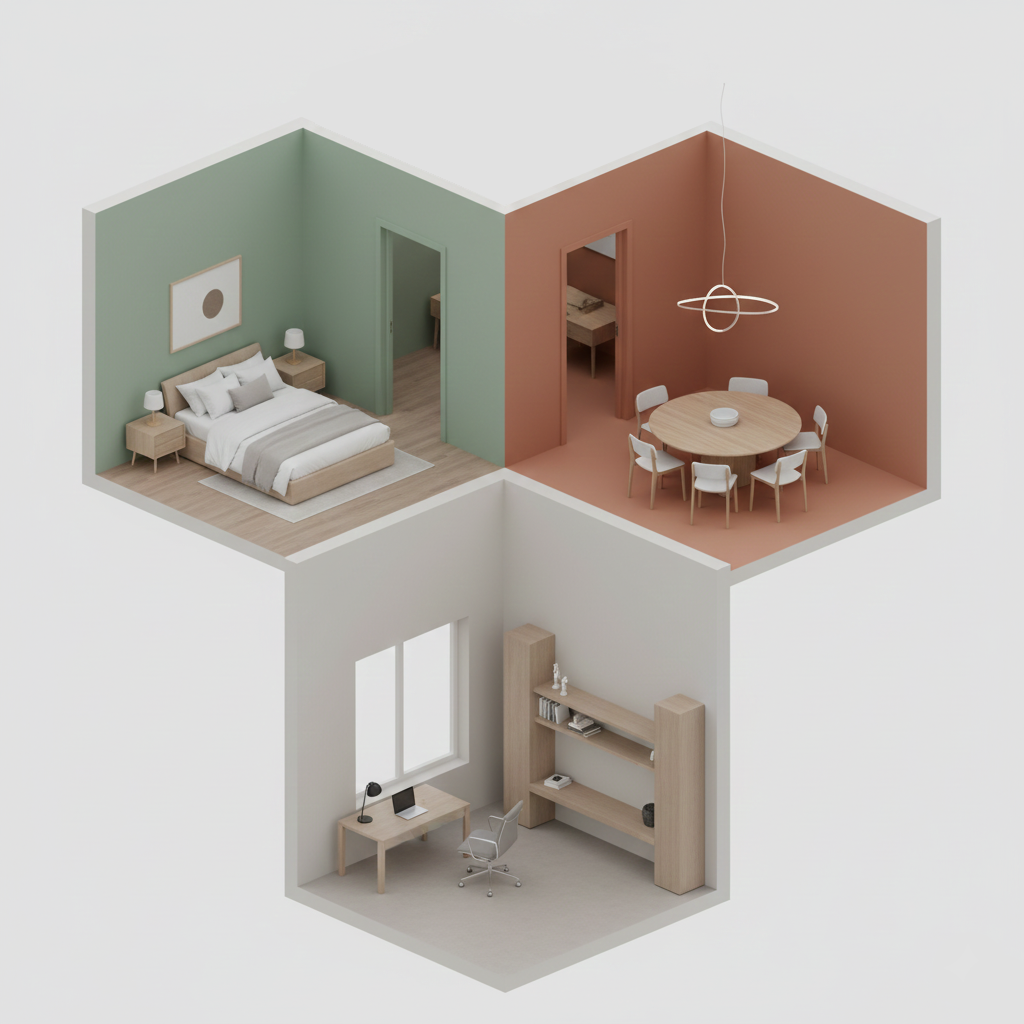
Bedroom: A place for rest. Cool, calming shades—misty blues, sage greens—or soft beiges help slow the heart rate and improve sleep quality. Avoid stimulating colors like red.
Children’s Room: Balance is key. Instead of rigid “pink or blue” choices, opt for gentle pastels that stimulate creativity without overwhelming. Color zoning can help define sleep and play areas.
Bathroom: White and light blue remain classics for cleanliness and freshness. Recently, darker greys and wood tones have become popular for creating a spa-like atmosphere.
Hallways & Entryways: Often darker transition spaces—and perfect places to take risks. A bold color or patterned wallpaper can instantly give your home character from the moment you enter.
Unless you’re renovating from scratch, some elements stay. Consider your flooring, existing furniture, and finishes. Wall colors should complement, not compete with them. Shades like greige (a blend of grey and beige) are especially versatile, working well with both warm and cool materials.
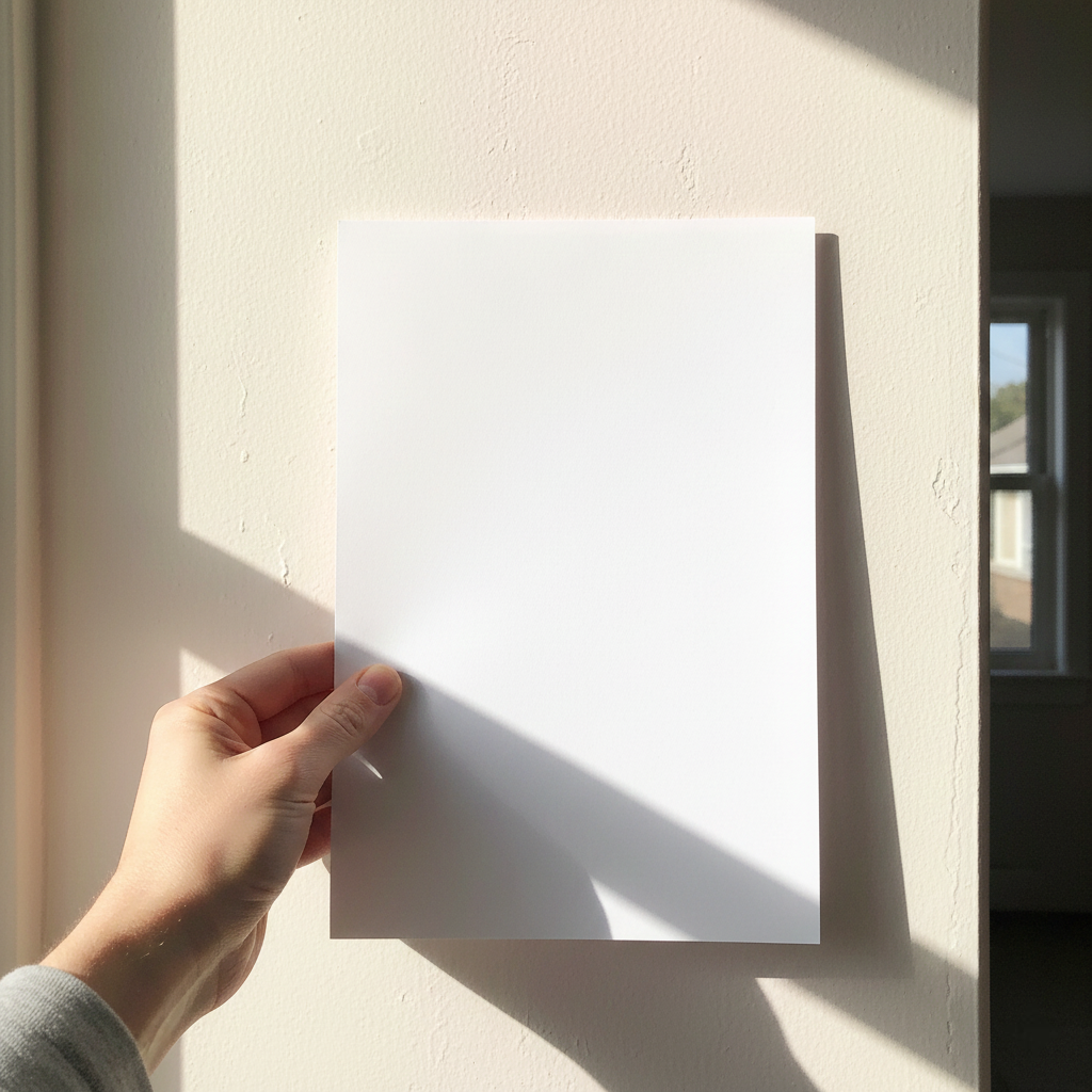
This is, in my opinion, the most critical step. No color is ever just “white” or “grey.” Every paint has an undertone. Why does your grey look blue on the wall? A cool undertone. Why does your beige turn pink? A red undertone.
Tip: Place the color next to a pure white sheet of paper. Hidden undertones become much easier to see.
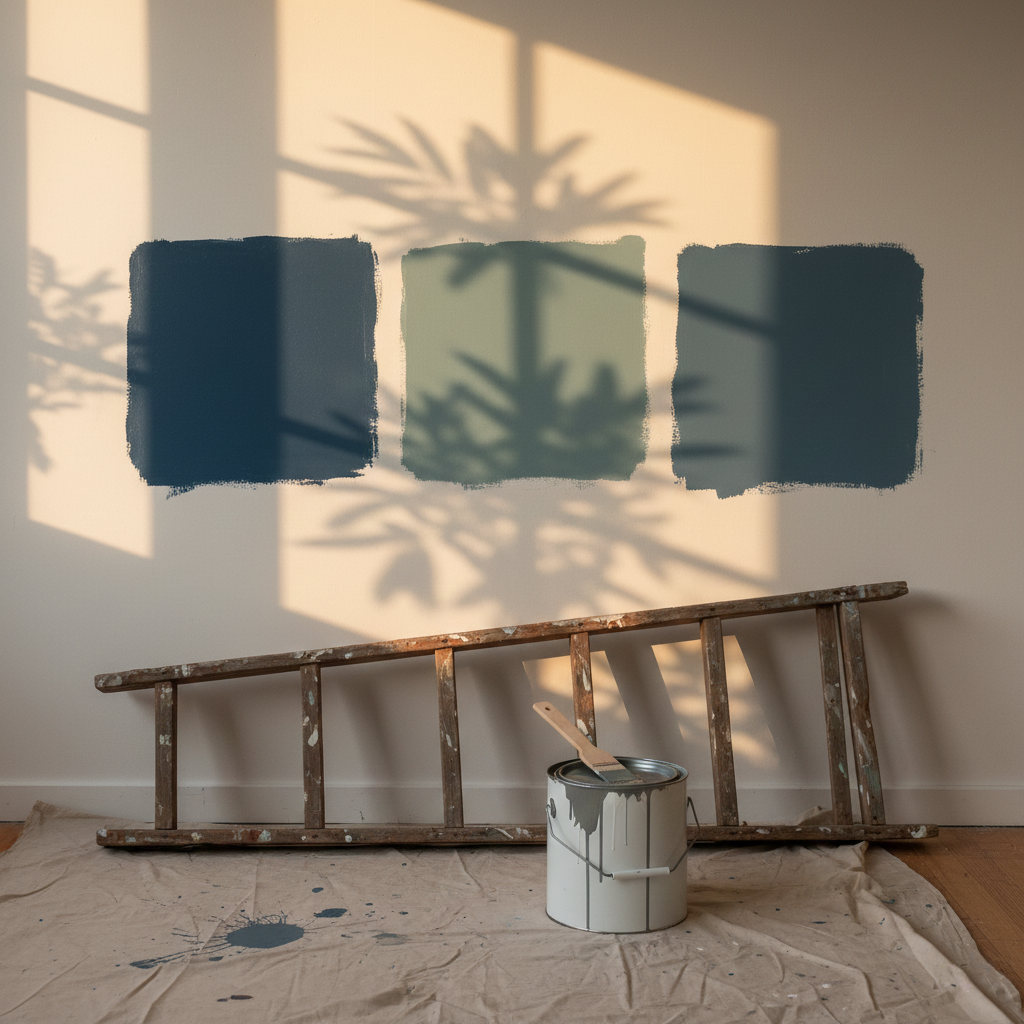
My strongest professional advice: never commit based solely on a color chart. Buy a sample, apply it to a board, and move it around the room. Observe it in the morning, at noon, and in the evening under artificial light.
Please don't forget trends come and go, but your home is your sanctuary. Choose colors that feel right for you—not just what’s fashionable. And remember, we’re always here to help.